
The Room That Breaks Every Safe Decorating Rule (and Wins)
If you've spent any time on interior design Pinterest, you'll know that the safe play is always the same. Greige walls. White linen. One artfully placed throw. It's inoffensive, it photographs well, and it has absolutely no personality.
This is not that room.
The bedroom and dressing room you're looking at went viral on our Pinterest page for a reason…they articulate something that a lot of people feel but few know how to execute: that a bedroom should feel like something. Not a hotel room, not a showroom, not a neutral backdrop for your life. A room with a genuine point of view.
Here's exactly why it works.
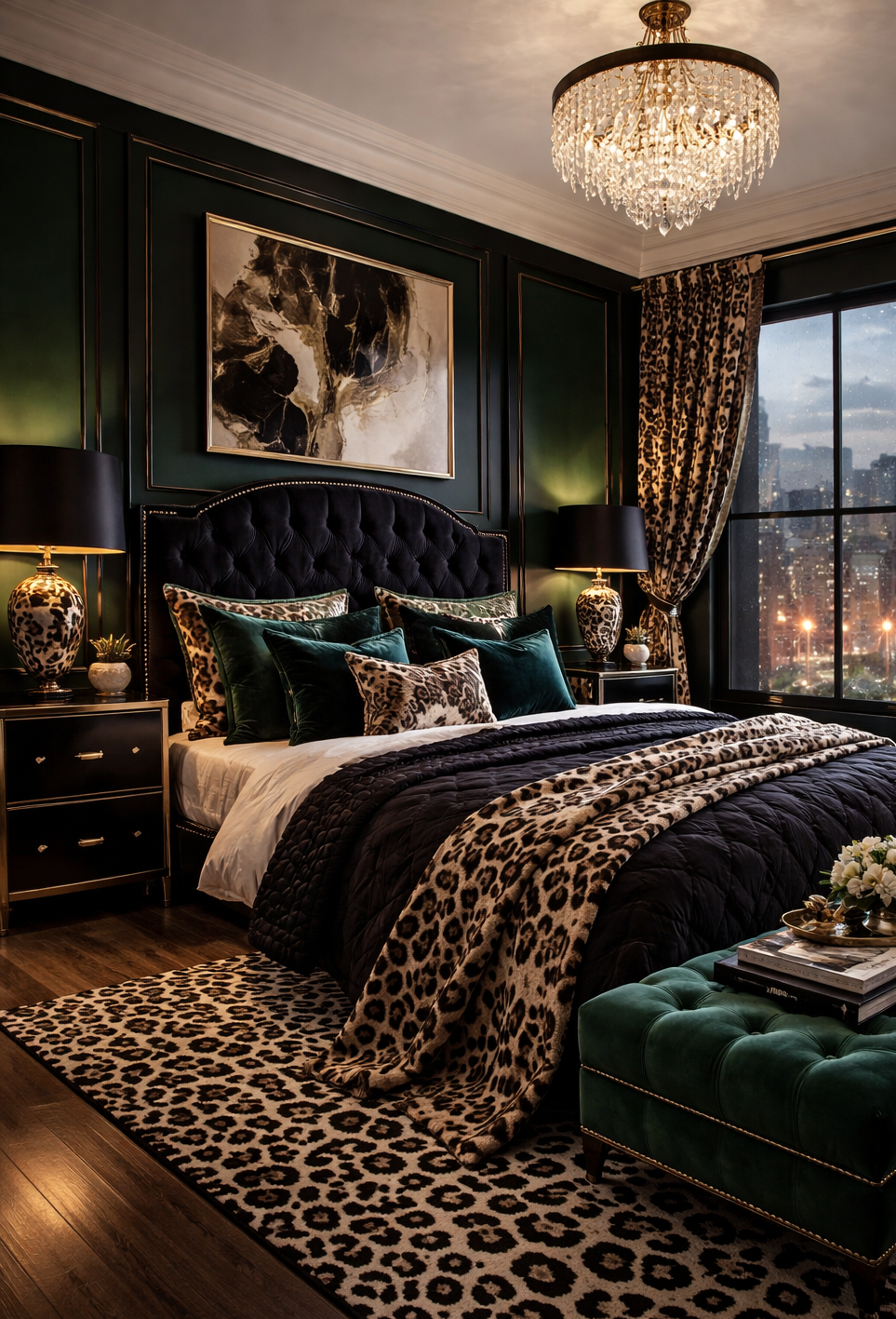
The foundation: dark walls done properly
Deep hunter green panelling sets the entire tone. This is a committed choice — there's no safety net of a single feature wall or a lighter ceiling to hedge the bet — and that commitment is precisely what elevates it. When you go dark, you go all in, and the result is a room that immediately reads as intentional rather than accidental.
The wall panelling adds architectural weight that plain painted walls never quite achieve. It creates shadow and dimension, makes the space feel taller and more considered, and gives every other element in the room something to push against. Dark walls don't make a room feel smaller — a common fear — they make it feel contained in the best sense, like a room that knows what it is.
The pattern play: why leopard print works here
Leopard print is the most misunderstood pattern in interiors. Used carelessly, it reads as kitsch. Used as a neutral — which is, in fact, what it is — it becomes the most versatile and quietly sophisticated pattern in the room.
Here it appears in four places: the rug, the throw across the bed, the curtains, and the lamp bases. The repetition is intentional. By committing to the print across multiple surfaces, it stops reading as a statement and starts reading as a palette — a consistent thread that ties the room together in the same way that a repeating geometric would in a more conventional scheme. The tonal range of a leopard print (cream, camel, chocolate, black) works with almost anything, which is why it sits so comfortably against both the deep green and the black velvet.
The rule it follows: use a pattern enough times that it becomes part of the architecture of the room, not a decorative afterthought.
The velvet: texture as the real luxury indicator
Two emerald velvet pieces anchor the room — a tufted bed bench in the bedroom, a low chesterfield in the dressing room — and both are doing significant work. Velvet communicates luxury before it communicates anything else. It catches light differently at every angle, it photographs with depth, and it provides the tactile contrast that all genuinely well-dressed rooms need.
The choice of emerald specifically is what makes the whole scheme cohere. It is dark enough to disappear into the green walls but rich enough to read as a separate element — a jewel tone that the eye finds without being directed to it. Paired with the navy black velvet headboard, it completes a palette (deep green, navy, cream, camel, gold) that is complex enough to be interesting and disciplined enough to hold together.
The details that do the most work
The crystal chandelier is the room's one act of pure glamour, and it earns its place by contrast. Against the dark walls and heavy pattern, it reads as relief — a lightness that the room needs without compromising its overall mood. This is the correct use of a chandelier: not as a statement in itself but as a counterpoint to everything surrounding it.
The leopard-print lamp bases with black shades are the detail most people would hesitate over and most designers would tell you to do. They extend the print upward, off the floor and into eye-level sightlines, creating a layered effect that gives the room its sense of completeness. When a scheme has been thought about at every height — floor to ceiling — it reads as finished in a way that rooms decorated only at eye level never quite do.
The dressing room's glass-fronted black cabinetry lit from within is the functional version of the same logic. Warm internal lighting transforms storage into display, making even a wardrobe feel considered. The dark marble vanity and gold hardware keep the palette consistent without repeating anything literally.
Why this aesthetic is having its moment
There is a reaction happening in interiors right now against the decade of beige that preceded it — against the safe, the inoffensive, the deliberately underdressed room. The dark maximalist aesthetic is where that reaction has found its most compelling expression, because it is not maximalism for its own sake but maximalism with a discipline: a dark, moody palette that contains the pattern and the texture and the detail within a coherent whole.
It is, in short, the interior equivalent of the red bag argument. Not a statement for its own sake. A considered position, executed all the way through.